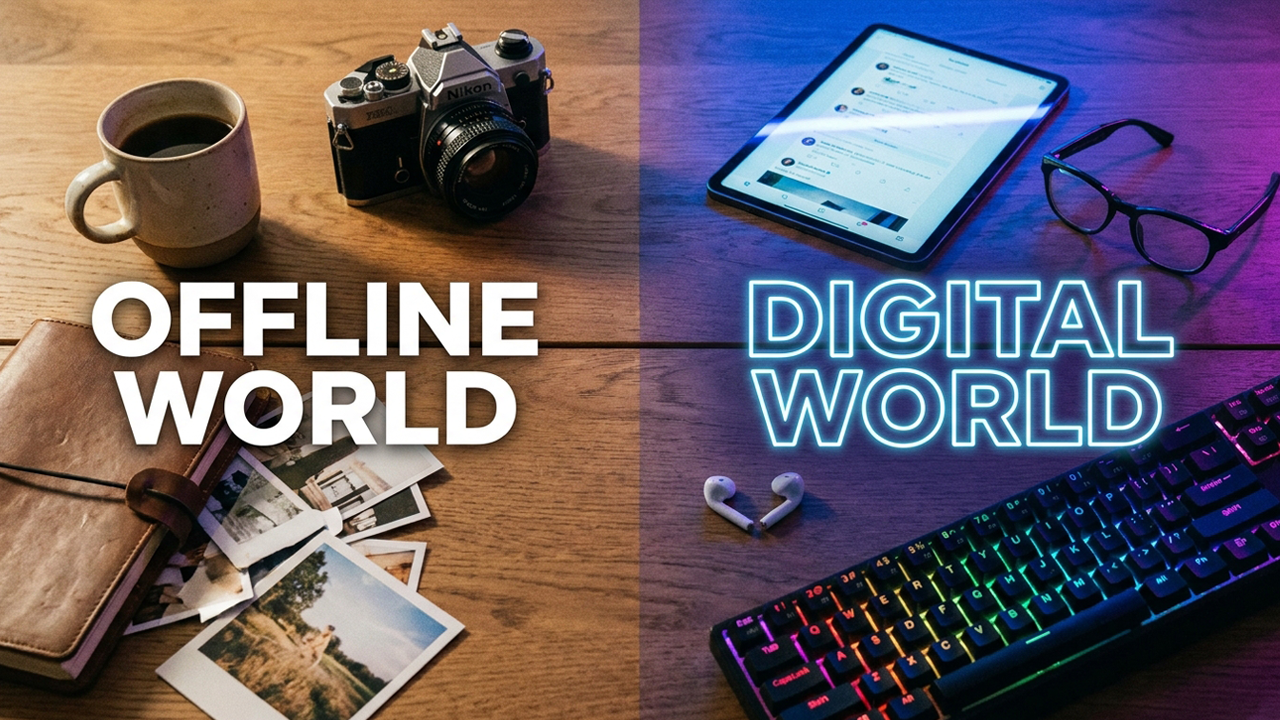
Last night I picked up my phone to check one message. Forty minutes later, I was watching a video about someone restoring a Victorian cabinet, had checked Instagram twice, added something to a cart I'll probably never buy from, and had completely forgotten what the original message was. There wasn't a moment where I decided to do any of that. One thing led to the next, and the next, and the next. This is not a personal failing. I want to be clear about that, because the instinct is always to frame it that way, to treat it as a discipline problem, a willpower problem, a you problem. But the more I think about how these environments are actually built, the less convincing that framing becomes. Something shifted in how digital interfaces were designed, and it didn't happen loudly.
It's worth naming what shifted, because it has a lineage. In 1998, the psychologist BJ Fogg founded the Stanford Persuasive Technology Lab, formalising a field called "captology," or computers as persuasive technologies, that studied how software could deliberately change human behaviour. Many of the designers who later built the engagement engines of Facebook, Instagram and Uber passed through Fogg's classes. The point isn't conspiracy; it's that persuasion became an explicit design discipline with its own research, its own vocabulary and eventually its own multi-billion-dollar industry.
Early digital design was mostly navigational. You went somewhere to find something, you found it, and you left. The interface served the task. What's happened since, gradually and then comprehensively, is that design stopped being primarily about navigation and started being about behaviour. Not where you go, but what you do. How long you stay. What you look at next. When you come back.
This is really the logic of what economists call the attention economy. As Herbert Simon observed as far back as 1971, "a wealth of information creates a poverty of attention," meaning that when information is abundant, attention becomes the scarce resource worth competing for. The metrics that came to define success reflect exactly that scarcity: daily active users (DAU), session length, time-on-app and "engagement" broadly defined. A navigational interface that helps you leave quickly is, by these metrics, a failure. The incentive quietly inverted: the good product became the one you couldn't put down.
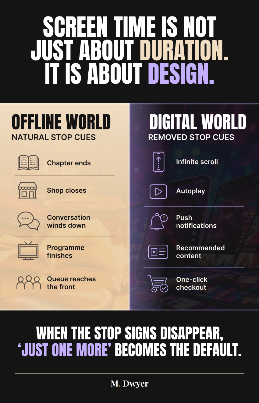
TikTok is probably the clearest example of this shift, though Instagram Reels got there quickly too. The video ends and another starts. You don't choose it; it just arrives. Autoplay teaches continuous viewing not through persuasion but through structure. It removes the micro-moment where you'd otherwise decide whether to keep going. Infinite scroll does something similar: it eliminates the end of the page, which used to function as a natural prompt to stop. Notification badges manufacture urgency where none necessarily exists. One-click checkout compresses the gap between impulse and purchase to almost nothing. "Recommended for you" turns what used to be active browsing into something closer to passive reception.
Each of these mechanisms has a traceable origin. Infinite scroll was invented in 2006 by the engineer Aza Raskin, who has since said he feels a measure of guilt for it, estimating that the design collectively costs humanity enormous amounts of time each day and comparing it to eating from a bottomless bowl of soup that quietly refills. Autoplay followed a similar path: YouTube switched autoplay on by default in 2015, and Netflix's "post-play" countdown, which starts the next episode before you've had time to reach for the remote, launched in 2012. TikTok pushed the model furthest by making autoplay not a feature but the entire interface. There is no "play" button to decline, and the app's average user reportedly opens it around 19 times a day and spends well over an hour there, precisely because the format never presents a natural place to stop.
None of these features are accidental. Each one is the result of someone making a deliberate choice about where to place friction and where to remove it.
Friction, in interface design, simply means anything that slows a user down or forces a conscious decision: an extra tap, a confirmation prompt, a login screen, the end of a page. For decades, reducing friction was treated as an unambiguous good, the whole point of "usability." What's changed is the recognition that friction isn't only an obstacle; it's also where deliberation lives. Remove every point of resistance and you don't just make product easier to use. You make it harder to stop using.
Here's the thing about offline life that I keep coming back to: it's full of endings. A chapter finishes. A shop closes. An episode ends. A conversation winds down naturally. These aren't just logistical facts; they're behavioural cues. They signal completion. They create a moment where you can choose what to do next rather than having the environment choose for you.
Behavioural researchers sometimes call these "stopping cues," the natural signals that tell us a unit of activity is complete. The bottom of a printed page, the final track on an album, the last chip in the bag: each one triggers a small decision point. The design critic Tristan Harris, who coined the phrase "time well spent," has argued that traditional media were full of these built-in exits, and that removing them is one of the most consequential things a digital product can do. Wendy Wood, a psychologist who has spent decades studying habit formation, makes a related point: habits are cued by environment far more than by conscious intention, which is why changing the environment is usually more effective than trying to summon more willpower.
Digital spaces have systematically dissolved those cues. And I think that's actually the more interesting part of this conversation, not the volume of content or the addictiveness of the platforms, but the specific removal of the things that tell us an experience is over. The most persuasive part of the interface may not be what it shows us, but what it withholds: the ending. When you take away the natural stopping point, you don't just extend the session. You gradually train a different kind of attention. One that's oriented toward the next thing rather than the present one. One that treats completion as a brief pause rather than an actual end. Spend enough time in environments built this way and the training starts to transfer.
There's measurable evidence that this kind of training leaves a mark. Gloria Mark, an informatics professor at UC Irvine who has tracked attention on digital devices for two decades, found that the average length of time people stay focused on a single screen fell from about 2.5 minutes in 2004 to roughly 47 seconds by the early 2020s. Once attention shifts away from an interrupted task, her research shows it takes an average of over 20 minutes to return to it fully. These aren't figures about screen time in the aggregate; they're about the texture of attention itself, about how long we can hold still before reaching for the next thing.
This is where it gets genuinely interesting to me, because the effects aren't contained to screen time. Think about what these systems are conditioning at a behavioural level. An expectation of constant novelty. A lower tolerance for pauses. Faster decision-making under less information. More frequent comparison. Less resistance to spending. A tendency to treat boredom as a problem that needs to be solved immediately rather than something to simply sit with.
The mechanism underneath a lot of this is old and well understood. The psychologist B.F. Skinner demonstrated in the mid-twentieth century that the most compulsive behaviour comes not from consistent rewards but from variable ones, a "variable-ratio reinforcement schedule," the same principle that makes slot machines so effective. A pull-to-refresh feed is a near-perfect variable-reward device: most refreshes give you nothing much, but occasionally there's something genuinely good, and the unpredictability is exactly what keeps the thumb moving. Layer on decision fatigue, the well-documented finding that the quality of our choices degrades as we make more of them in quick succession, and you have an environment engineered to keep us choosing quickly and often, while steadily eroding our capacity to choose well.
Dating apps are a useful example here, and not just because they're culturally visible. The more matches, the more likes, the more swipes, the better the feedback loop. Many of them are now subscription-based precisely because infinite scroll is a feature worth charging for. You're not paying for access to more people. You're paying for the removal of limits. That's a product decision, and it says something about what the platform knows about the value of frictionlessness.
The economics make the incentive explicit. Match Group, which owns Tinder, Hinge and OkCupid among others, generated over $3 billion in revenue in recent years, the overwhelming majority of it from subscriptions and paid features rather than advertising. Tinder's swipe mechanic, introduced in 2013 and quickly imitated across the industry, deliberately borrows the physical gesture of dealing cards, and its paid tiers (Tinder Plus, Gold, Platinum) largely sell relief from the free version's limits: unlimited likes, the ability to see who already liked you, more "super likes." Hinge markets itself with the tagline "designed to be deleted." Like most subscription-based services, however, dating apps generate revenue while users remain engaged. That creates an understandable commercial incentive to make continued use feel effortless, even if individual design decisions are shaped by many different product, user-experience and business considerations.
The same logic applies across ecommerce, streaming, news platforms, delivery apps and productivity tools. The mechanisms differ but the underlying design principle is consistent: reduce the moments where the user might pause and reconsider. Make the next action obvious. Make the exit less visible.
The specifics are instructive. Amazon patented "1-Click" ordering in 1999 and guarded it fiercely until the patent expired in 2017, because collapsing the purchase into a single tap measurably increases how much people buy. Every removed step is a removed opportunity to reconsider. Streaming services autoplay the next episode within seconds; news and social feeds refresh endlessly and pepper the screen with red notification dots calibrated to feel unresolved; delivery apps default to saved payment details and prompt reorders. In each case the design goal is the same: shorten the distance between impulse and action, and lengthen the distance between the user and the door.
I'm not trying to make a moral argument here. These platforms aren't uniquely evil, and I find the performative outrage around screen time a bit tiresome. Most of it lands on individual behaviour and misses the more structural point entirely. Articles about digital wellbeing tend to produce one of two responses: either "just put your phone down," which treats this as purely a self-control issue, or a kind of doom-scrolling about doom-scrolling that doesn't actually help anyone think more clearly. The framing I'd push for is different. Not "how much screen time is too much?" but "what is this interface encouraging me to do?" That's a more useful question, and it applies whether you're spending three hours a day on social media or thirty minutes. Time is one variable. Behavioural conditioning is another, and it's the one we talk about less. The consumer conversation that would actually move things forward isn't about logging off. It's about understanding that digital environments are not neutral. They have incentives. They have designers. They make choices about where to place resistance and where to smooth it away. Recognising that is not paranoia. It's just a more accurate model of what's happening. What would it look like to design environments that restore some of that friction? Or to choose them more deliberately when they exist? Some of this is already happening in small ways: apps that ask if you want to keep watching, usage dashboards and notification batching. Whether those features are genuinely useful or just liability coverage is a fair question. Most of them are opt-in, which means the default still points the other way.
The examples exist but reveal their own limits. Apple's Screen Time launched in 2018 and Google's Digital Wellbeing arrived the same year; Instagram added a "You're All Caught Up" marker and a "Take a Break" reminder; Netflix eventually added an "Are you still watching?" prompt after several hours. Regulators have started to circle the underlying design choices too: the European Union's Digital Services Act, which came into force in 2024, explicitly targets "dark patterns", interfaces designed to manipulate users into decisions they wouldn't otherwise make, and California's own privacy law has taken aim at the same tactics. But almost all of the wellbeing tools are switched off by default and buried in settings, which tells you something about how seriously the removal of friction is meant to be taken. A stopping cue you have to go looking for is not really a stopping cue.
Defaults are where the real design is. Most people don't change them. The evidence for this is striking and comes from well outside tech. In a landmark 2003 study, the behavioural scientists Eric Johnson and Daniel Goldstein compared organ-donation rates across European countries and found that nations where citizens were enrolled by default and had to opt out saw consent rates above 90 percent, while comparable opt-in countries languished below 30 percent, often in the teens. Same cultures, same broad attitudes; wildly different outcomes, driven almost entirely by which box was ticked to begin with. The lesson transfers directly: whoever controls the default controls the behaviour of the vast majority, because the vast majority never changes it.
Technology has become one of the most influential behavioural environments humans have ever created. Yet we spend remarkably little time teaching people how those environments work: not only what content they contain, but how that content is presented, what a platform rewards, and what its algorithms are designed to optimise.
The goal isn't fear, guilt or the rejection of technology. It's awareness. Once you understand how an interface structures choices, removes stopping cues and decides what appears next, you're in a much better position to ask whether your behaviour reflects your intentions or simply follows the path made easiest.
Perhaps that's the next step in digital literacy: not just learning how to use technology, but learning how technology uses design and algorithms to shape what we notice, choose and do.